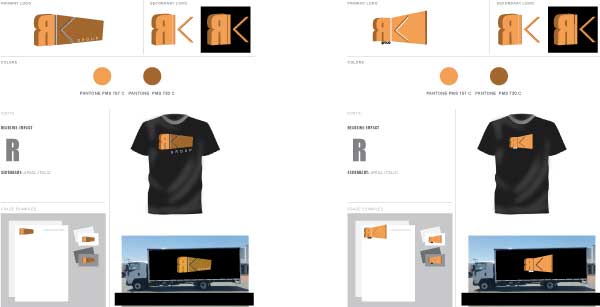
As a business your brand is your signature. It needs to be versatile, and sustainable. It should be adaptable to a website design, a T-Shirt, your vehicle, or even your coffee cup. Each part of the brand should be well thought out and designed with a purpose and a style guide.
Colours, fonts, and essential features and elements will be crucial to your design. Is there a lot of negative space? Are the contour lines very thin or too thick? and what about the hues and shades, are there any, and if so, what purpose do they seek?
Below is a quick style guide I did for RK Freight services. It is a mock up and in it’s developmental stages. I have sough feedback and have developed it in a couple of ways, as you can see. The purpose of this is that, for any designer, it is important to try out mocking up you logo so that it can be seen in different ways.
A logo is not just at ‘the point of sales’, it is more diverse and serves it purpose throughout the industrial process. It may be in the hands of the receptionist, to another designer, the printing company or just a friend. With this is mind keep your logos versatile, allow them to be re-created in different ways, and on different things. Overall, as a designer keeping up with the momentum will be a full time job. That is why a style guide is an essential resource for any business.

